
An In-Depth Calculation Of COVID-19 Cases And Deaths

https://free-images.com/display/new_york_city_skyline-b_5.html
COVID-19 is in every corner of the world two years after the pandemic was declared on March 11, 2020. North Korea has reported COVID-19 cases since May 2022. I suspect North Korea is just acknowledging it now. COVID-19 was likely spreading in North Korea early on as it shares a border with China. The border with North Korea and China are quite porous. Turkmenistan has not reported any COVID cases yet. I suspect there are many COVID cases and deaths in Turkmenistan that are undetected.
There have been attempts to calculate the truth death toll from the pandemic. The Economist calculates somewhere between 15.3 to 25.6 million deaths as of May 23. 2022. China’s death toll is 366 times higher than reported, which is 17,000 percent higher as of January 5, 2022. That puts the death toll around 1.7 million in China.
The data is from Worldometer as of June 12, 2022. Here are confirmed cases and deaths maps as of June 12, 2022. The maps are created with QGIS. The statistical analysis are with PSPP and JASP.
Confirmed Cases

Deaths

America has the most confirmed cases and deaths worldwide. India and Brazil are second and third in terms of confirmed cases. Brazil is second in terms of death, while India is third. North Korea’s COVID death is highly dubious. I suspect North Korea’s COVID deaths are much higher than reported. I have said in the past, there are cases that go undetected and deaths that go unreported.
Here are the formulas I have used to calculate COVID-19 cases and deaths:
Projected Per Capita Cases
(1 + Confirmed Case Rate Per Capita) / (1 + Not Infected Per Capita)
Projected Per Capita Deaths
(Death Per Capita + Death Rate) / (5 + Not Deaths Per Capita)
I decided not to include positive rates from test for various reason. Some nations do not release test numbers and positive rates. There is also at-home COVID tests, that go unreported. Here is the Projected Per Capita Cases or Infection Rate.
Projected Per Capita Cases or Infection Rate

Faeroe Islands has a projected infection rate of 131 percent, which means everyone there has been infected by COVID. Other nations that have over 100 percent are Gibraltar, Andorra, Iceland, Denmark, and San Marino. They are all small European nations that over 100 percent infection rate. America has over 72 percent infection rate. Here is the top 20 infection rate.
| Nation | Projected Per Capita Cases |
| Faeroe Islands | 1.315 |
| Gibraltar | 1.081 |
| Andorra | 1.080 |
| Iceland | 1.069 |
| Denmark | 1.017 |
| San Marino | 1.004 |
| Slovenia | 0.993 |
| Martinique | 0.984 |
| Portugal | 0.980 |
| Saint Pierre Miquelon | 0.976 |
| Falkland Islands | 0.962 |
| Austria | 0.962 |
| Netherlands | 0.962 |
| St. Barth | 0.956 |
| Réunion | 0.949 |
| Liechtenstein | 0.947 |
| France | 0.942 |
| Latvia | 0.935 |
| Israel | 0.934 |
| Seychelles | 0.930 |
The highest infection rates are in Europe. Martinique, Saint Pierre Miquelon, Falkland Islands, Saint Barthélemy, Réunion, Israel, and Seychelles are the non-European to be in the top 20 infection rate. Here is the bottom 20 infection rate.
| Nation | Projected Per Capita Cases |
| Western Sahara | 0.500 |
| Macao | 0.500 |
| China | 0.500 |
| Tuvalu | 0.500 |
| Micronesia | 0.500 |
| Marshall Islands | 0.500 |
| Saint Helena | 0.500 |
| Niger | 0.500 |
| Yemen | 0.500 |
| Chad | 0.500 |
| Tanzania | 0.500 |
| Sierra Leone | 0.501 |
| Burkina Faso | 0.501 |
| DRC | 0.501 |
| Nigeria | 0.501 |
| Nauru | 0.501 |
| Sudan | 0.501 |
| Liberia | 0.501 |
| Mali | 0.501 |
| South Sudan | 0.501 |
The nations with the lowest projected infection rates are around 50 percent. They are Western Sahara, Macao, China, Tuvalu, and Micronesia. They are mostly African and island nations. Chinese numbers should be taken with a grain of salt.
Projected Cases

The projected cases are:
Projected Per Capita Cases x Nation Population
The nations with the most projected cases are India, China, America, Indonesia, and Brazil. Pakistan and Nigeria are the other nations to have over 100 million projected cases. Here is a chart of the top 20 projected cases.
| Nation | Projected Cases |
| India | 736103751 |
| China | 719830563 |
| America | 242699254 |
| Indonesia | 144164927 |
| Brazil | 133196732 |
| Pakistan | 115761832 |
| Nigeria | 108221115 |
| Russia | 87735662 |
| Bangladesh | 85411700 |
| Mexico | 70246158 |
| Japan | 69894187 |
| Germany | 66101360 |
| France | 61764011 |
| Ethiopia | 60605651 |
| Philippines | 59022600 |
| Vietnam | 58029447 |
| Turkey | 55439516 |
| United Kingdom | 54349562 |
| Egypt | 53428451 |
| Iran | 48703356 |
COVID is all over the world regardless of location. It is likely COVID was worldwide before it was even reported on December 30, 2019. The 2019 Military World Games was held in Wuhan on October 18, 2019 to October 27, 2019. Luxembourg triathlete Oliver Gorges reported that Wuhan was a ghost town. That suggest Wuhan was already in lockdown. China knew COVID was spreading rapidly in Wuhan. They did not let the world know what was going on until December 30, 2019. It had been spreading in Wuhan and worldwide prior to start of 2020. French pentathlete Elodie Clouvel was ill during the games. Many athletes reportedly fell ill with symptoms similar to COVID-19. It is likely that the Military World Games was a superspreading event as 10,000 athletes from 100 nations participated. From what it looks like, COVID likely started before October 2019. It is probable COVID started in spring to summer of 2019.
The 2019-2020 flu season started on a severe and early note. This would suggest COVID was already spreading in America and worldwide. I ran a statistical analysis on Projected Per Capita Cases or Infection Rate with JASP. It is a One Sample T-Test.
| Test | Statistics | df | P-Value | Location Difference | Lower 95% CI | Upper 95% CI | Effect Size | Lower 95% CI Effect Size | Upper 95% CI Effect Size |
| Student | 60.9682 | 227 | < .001 | 0.6391 | 0.6185 | 0.6598 | 4.0377 | 3.6398 | 4.4267 |
| Wilcoxon | 26106 | < .001 | 0.6165 | 0.5925 | 0.6422 | 1 | 1 | 1 | |
| Z | 9.6507 | < .001 | 0.6391 | 0.5093 | 0.7689 | 0.6391 | 0.5093 | 0.7689 |
I use Student, Wilcoxon, and Z Test to calculate 95% Confidence Interval for COVID cases worldwide. The Student has the narrowest, while the Z Test has the widest. The total projected infection rate from all nations that report COVID is 4,424,651,294 as of June 12, 2022. The current estimated world population for 2022 is 8 billion and multiplied by projected infection rate. Here is the calculated total cases based on Student, Wilcoxon, and Z Test.
| Test | Lower 95% CI | Upper 95% CI | Lower 95% Cases | Upper 95% Cases |
| Student | 0.6185 | 0.6598 | 4948000000 | 5278400000 |
| Wilcoxon | 0.5925 | 0.6422 | 4740000000 | 5137600000 |
| Z | 0.5093 | 0.7689 | 4074400000 | 6151200000 |
The general consensus with the Student, Wilcoxon, and Z Test are that 60% of the world has been infected with COVID. The Z Test has up to nearly 77 percent of the world infected with COVID. The notion of 70 percent of the world’s population being infected already happened. I am not be surprised if nearly the whole world is already infected with COVID.
In March 2020, there were 8.7 million influenza-like illness (ILI), which suggests many of them were probably COVID. That would suggest COVID was widespread early on in America. People were talking about some strange flu going around in the 2019-2020 flu season starting in Fall 2019. It continue to spread in early 2020. This would suggest not all the flu cases were flu, but possibly COVID.
Many are wondering how many people have died from COVID. The death toll as of June 12, 2022 is 6,331,459. However, it is likely many deaths go unreported or reported as something else. Other times, some deaths are classified as COVID, but it is something else that is the cause of death. So, how many people have died from COVID.
There have been attempts to calculate COVID deaths based on excess mortality. Here is the Projected Per Capita Death.
Projected Per Capita Death

The highest projected death rate is in Yemen, which is in midst of the Yemeni Civil War. COVID deaths and cases in Yemen are likely going unreported. That same would go with Ukraine, Eritea, and Syria. The next highest is Western Sahara and third goes to Sudan. America does not even crack the top 50 in terms of projected death rates from COVID. Here is the top 20 death rates.
| Nation | Projected Dearths Per Capita |
| Yemen | 0.030 |
| Western Sahara | 0.017 |
| Sudan | 0.013 |
| Peru | 0.011 |
| Mexico | 0.010 |
| Syria | 0.009 |
| Somalia | 0.008 |
| Egypt | 0.008 |
| Bosnia and Herzegovina | 0.008 |
| Afghanistan | 0.007 |
| Ecuador | 0.007 |
| Liberia | 0.007 |
| Bulgaria | 0.006 |
| Niger | 0.006 |
| North Macedonia | 0.006 |
| Myanmar | 0.005 |
| Paraguay | 0.005 |
| Malawi | 0.005 |
| Gambia | 0.005 |
| Tunisia | 0.005 |
The nations with the highest projected death rates are in Africa, Americas, and Europe. Many nations have not reported many COVID deaths. It is probable many deaths go unreported regardless of nation.
The projected deaths are:
Projected Per Capita Deaths x Nation Population
Projected Deaths

The nation with the most projected death is China with over 5.5 million deaths. India comes in second at over 2.9 million deaths. Mexico is third with over 1.2 million deaths. America has nearly 835,000 deaths. It suggests American deaths could be over reported. A stark contrast with China which severely under reported COVID deaths. Here is a chart of the top 20 projected cases.
| Nation | Projected Deaths |
| China | 5575580 |
| India | 2932742 |
| Mexico | 1279614 |
| Indonesia | 1228689 |
| Yemen | 942630 |
| Brazil | 874698 |
| Egypt | 848057 |
| USA | 834938 |
| Pakistan | 763093 |
| Sudan | 606423 |
| Russia | 566978 |
| Nigeria | 442160 |
| Bangladesh | 421967 |
| Peru | 371234 |
| Philippines | 316820 |
| Ethiopia | 316386 |
| Iran | 303984 |
| Myanmar | 294281 |
| Afghanistan | 289926 |
| South Africa | 275299 |
China tops out. South Africa bottoms out of the top 20 at over 275,000 deaths. Yemen is in the top 5 for projected deaths at 942,630 deaths. North Korea’s COVID death reports should be taken with a grain of salt. I suspect North Korea’s COVID deaths are in the thousands. I ran a statistical analysis on Projected Per Capita Deaths or Death Rate with JASP. It is a One Sample T-Test.
| Test | Statistics | df | P-Value | Location Difference | Lower 95% CI | Upper 95% CI | Effect Size | Lower 95% CI Effect Size | Upper 95% CI Effect Size |
| Student | 12.957 | 227 | < .001 | 0.0025 | 0.0021 | 0.0029 | 0.8581 | 0.7055 | 1.0093 |
| Wilcoxon | 24090 | 227 | < .001 | 0.0022 | 0.0019 | 0.0024 | 1 | 1 | 1 |
| Z | 0.0376 | 227 | 0.97 | 0.0025 | -0.1273 | 0.1323 | 0.0025 | -0.1273 | 0.1323 |
I use Student, Wilcoxon, and Z Test to calculate 95% Confidence Interval for COVID deaths worldwide. The Wilcoxon has the narrowest, while the Z Test has the widest. The p-value for the Z-Test is 97%, so I am going to disregard it as it is above 5%. The total projected COVID deaths worldwide from calculation is 25,698,096 as of June 12, 2022. The current estimated world population for 2022 is 8 billion and multiplied by projected death rate. Here is the calculated projected death based on Student, Wilcoxon, and Z Test.
| Test | Lower 95% CI | Upper 95% CI | Lower 95% Cases | Upper 95% Cases |
| Student | 0.0021 | 0.0029 | 16800000 | 23200000 |
| Wilcoxon | 0.0019 | 0.0024 | 15200000 | 19200000 |
| Z | -0.1273 | 0.1323 | -1018400000 | 1058400000 |
The Student and Wilcoxon have total deaths somewhere between 15.2 million to 23.2 million COVID deaths worldwide. The Z Test has over a billion COVID deaths, which is unlikely. It probable that over 15 million people have died from COVID worldwide.
One has to wonder about the discrepancy when it comes to COVID deaths. Here is a map of Differences Between Reported And Projected Deaths.
Differences Between Reported And Projected Deaths

Looking at the map, many nations are likely under reporting COVID deaths based on difference between reported and projected deaths. The nations with yellow to purple shades are under reporting COVID deaths. The nations with blue to light green shades are over reporting COVID deaths. It is quite large like in China, India, Mexico, and Indonesia. Some nations are simply are overwhelmed, while others are covering up deaths. Here are chart of the top 20 of most under reported and over reported Differences Between Reported And Projected Deaths.
Top 20 Under Reported
| Nation | Differences Between Reported And Projected Deaths |
| China | 5570354 |
| India | 2407981 |
| Indonesia | 1072046 |
| Mexico | 954428 |
| Yemen | 940481 |
| Egypt | 823444 |
| Pakistan | 732712 |
| Sudan | 601473 |
| Nigeria | 439016 |
| Bangladesh | 392836 |
| Ethiopia | 308870 |
| Afghanistan | 282217 |
| Myanmar | 274847 |
| Philippines | 256359 |
| Tanzania | 248923 |
| DRC | 235296 |
| Brazil | 206521 |
| Algeria | 189846 |
| Russia | 186958 |
| South Africa | 173815 |
The nations that are under reporting COVID deaths tend to have authoritarian governments like China, Russia, Myanmar, Sudan, and Afghanistan. Other nations are ravaged by war like Yemen and Ethiopia. Some are just stretched beyond their limits like India, Indonesia, and Mexico. China has the most under reported COVID deaths.
Top 20 Over Reported
| Nation | Differences Between Reported And Projected Deaths |
| USA | -200909 |
| France | -69482 |
| UK | -57776 |
| Italy | -44157 |
| Germany | -43428 |
| Spain | -22291 |
| Czechia | -15167 |
| Belgium | -11643 |
| Portugal | -11518 |
| Netherlands | -10702 |
| Greece | -10250 |
| Austria | -8965 |
| S. Korea | -8871 |
| Georgia | -7294 |
| Slovakia | -6526 |
| Switzerland | -6066 |
| Israel | -5024 |
| Croatia | -3840 |
| Lithuania | -3827 |
| Slovenia | -3296 |
The nations that are over reporting COVID deaths are mostly in Europe. South Korea and Israel are the only Asian nation that appear to be over reporting COVID deaths. Some of the COVID deaths could be caused other conditions at the time of death. Many severe COVID cases are connected to pre-existing conditions ranging from obesity, diabetes, hypertension, and chronic pulmonary disease. Some COVID deaths in America should not have been classified as COVID. America has the most over reported COVID deaths. France and United Kingdom come in second and third. Some deaths are classified as COVID, while other deaths are classified as other than COVID.
Cause of death is not an exact science. Some deaths early on in 2019 to 2020 could of been COVID as it was spreading around the world before it was even identified. Many COVID deaths were under reported, like in New York and Michigan. Most of these under reported deaths were in nursing homes. Nursing homes are where many COVID cases and deaths occurred early on in 2020 in America.
The first known COVID death in America occurred on January 9, 2020 in Leavenworth, Kansas. It is far away from Wuhan. Lovell “Cookie” Brown is the first COVID death in America. She did not travel outside of America before she died. It suggests COVID was already spreading in America. I would not be surprised if there are more COVID deaths in America that happened early on. I suspect there were COVID deaths in 2019. Lovell “Cookie” Brown’s death is not likely to be the first COVID death in America. In fact, we may never know who is the first COVID death in America.
The calculated cases and deaths are just projections. They are to be taken with caution. They can give us an idea of potential COVID-19 infections and deaths.
2021 Comes To A Close

2021 is about to enter memory lane. 2021 is just as tumultuous as 2020. COVID-19 pandemic remains a worldwide problem. 2022 is almost here. It has been over two years since the pandemic started in China. Let’s look at the daily new cases worldwide. The data is from Worldometers. The maps are created with QGIS. Here is the daily new cases for December 30, 2021.

America leads the world with 565,987 new cases. France is second with 206,243. Four nations have reported over 100,000 new cases. They are America, France, United Kingdom, Spain, and Italy. There are 1,874,615 new cases worldwide. It is likely underreported as not all nations have reported new cases. They likely have new cases. Let’s look at new cases per capita. It is per 1,000,000.

Saint Barthélemy has the highest new cases per capita at 27,615 per 1,000,000. Bermuda has the second highest at 6,555 per 1,000,000 new cases. America has 1,695 per 1,000,000 new cases. 565,987 new cases is a lot, but that is relatively low in terms of per capita. Many European nations have higher new cases per capita than America. Ireland has 4,094 per 1,000,000 new cases. Every new case adds to total cases. Some cases are over, while others are active. How many active cases are there as of December 30, 2021?

America has 12,933,384 active cases. United Kingdom is second at 2,327,923 active cases. Four nations have over a million active cases. They are America, United Kingdom, France, and Spain. Thirty-two nations have over a 100,000 active cases. There are 28,215,877 active cases worldwide as of December 30, 2021. Let’s look at active cases per capita. It is per 1,000,000.

Saint Martin has the highest active cases per capita at 70,441 per 1,000,000. Guadeloupe has the highest at 132,512 per 1,000,000. Martinique has 126,964 per 1,000,000. French Guiana has 118,641 per 1,000,000. Guadeloupe, Martinique, and French Guiana are part of France. America has 38,734 per 1,000,000. The one that gets the most attention are the ones that end up in hospitals and sometimes are on ventilators. Some of them end up dying. They are the severe COVID cases. How many severe cases are out there?

America has 17,821 severe cases, while India has 8,944 severe cases. Seventeen nations have over 1,000 severe cases as of December 30, 2021. There are 90,290 severe cases worldwide. Severe cases make up 0.32% of active cases worldwide. In America, it is 0.14% of active cases. Let’s look at severe cases per capita. It is per 1,000,000.

Andorra has the most severe cases per capita at 400 per 1,000,000. Lichenstein has 392 per 1,000,000 severe cases per capita. America has 53 per 1,000,000 severe cases. Large number of severe cases can overwhelm hospitals. However, many people who test positive for COVID with mild to no symptoms are flooding hospitals. It is happening in Vermont. People who are infected go to the hospital despite showing mild to no symptoms. The Harris Health System is asking people who test positive for COVID not to go to the emergency room if they have mild to no symptoms.
America have the highest new cases, active cases, and severe cases in sheer numbers. In terms of per capita, America is not the highest in new cases, active cases, and severe cases. Other nations exceed in terms of per capita in new cases, active cases, and severe cases.
2021 is coming to a close. I should get an idea of how many people died from COVID in 2021. I would like to look at how many people died in 2020 and 2021.
The Spread Of Omicron

https://free-images.com/display/new_york_city_skyline-b_5.html
The Centers for Disease Control and Prevention (CDC) estimates that 73 percent of new COVID-19 cases are the Omicron variant. However, hospitalization remains low compared to earlier this summer and past winter. In South Africa, the number of hospital admissions remains low despite more new cases. Here is a map of new COVID-19 cases as of December 21, 2021. It is from Worldometer. The map is created from QGIS.

America leads the world with 181,264 new cases. Let’s look at new cases per capita. It is per 1,000,000.

Europe has more new cases per capita than America, especially Denmark, France, and United Kingdom. If we use sheer numbers, than it appears America is the hot spot. However, Europe has more new cases per capita. That would suggest Europe is the hot spot.
Some suggest Omicron could be a repeat of March 2020, when COVID-19 was spreading worldwide. The World Health Organization (WHO) declared it a pandemic on March 11, 2020. Everything was closing left and right. Events were being cancelled. Students went into remote learning. New York City was becoming the epicenter of the COVID-19 pandemic in America. New York City is reporting more new cases than in Spring 2020. Let’s look at new cases, test numbers, and positive rates for America. They are from Our World In Data. The test numbers and positive rates are up to December 16, 2021. The data is always subject to change. The graphs are created from Apache OpenOffice.


The new case numbers are higher than compared to Spring 2020. However, there were less testing and higher positive rate compared to as of December 2021. It suggests COVID-19 was more widespread in early 2020. The 7 day and 14 day average in early 2020 are higher than in Winter 2020-2021 and December 2021. This is not like 2020 with Omicron spreading. Let’s look at New York City. The data is from New York City Health.
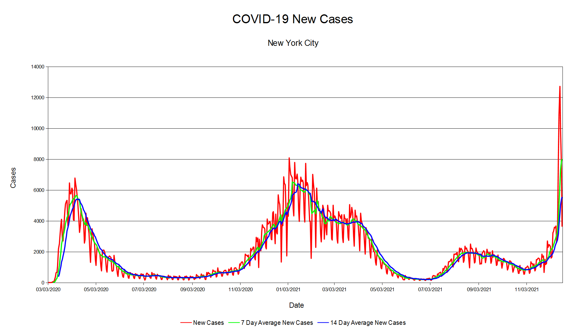


The new cases in New York City are higher than in Spring 2020. However, there are more tests being carried out. The positive rate is nowhere like Spring 2020. The positive rate in Spring 2020 peaked at 71 percent. This suggests COVID-19 was very widespread in New York City before we realized COVID-19 was spreading.
Lawrence Garbuz was not the first case at all. He was simply the first identified COVID-19 case in the New York City area. COVID-19 was already spreading in the New York City area. The Life Care Center in Kirkland was the first place to notice COVID-19 spreading. Like Lawrence Garbuz, the Life Care Center in Kirkland was the first COVID-19 epidemic to be noticed in America. COVID-19 was already spreading all over America as it was worldwide.
I do not think Omicron variant is going to be a repeat of 2020. Granted, it is more contagious, but I do not think it will be anything like 2020. The symptoms are milder compared to other strains. As for when the pandemic will subside, that is hard to determine. I am going to guess by 2022 when COVID-19 becomes an endemic virus. It is here to stay. Forecasting COVID-19 is more difficult than forecasting weather.
Omicron Variant

The Omicron variant (GR/484A (B.1.1.529)) of SARS-CoV-2 has been first reported in South Africa on November 24, 2021. However, the Netherlands has reported that the Omicron variant was already in the Netherlands and Europe before it was first identified. America reported the first Omicron variant case in the San Francisco Bay Area. South Korea reported five confirmed Omicron variant.
Since Omicron variant was already in the Netherlands before South Africa reported it. This suggests Omicron variant was already spreading before it was even first reported. Omicron is likely widespread in Africa, Asia, Europe, and America. We are just aware of its existence of the Omicron variant of COVID-19. So, what are the symptoms of Omicron variant?
Dr Angelique Coetzee is the first doctor to report on Omicron variant and the symptoms. Here is an excerpt from The Telegraph:
The first South African doctor to alert the authorities about patients with the omicron variant has told The Telegraph that the symptoms of the new variant are unusual but mild.
The Telegraph South African doctor who raised alarm about omicron variant says symptoms are ‘unusual but mild’
Dr Angelique Coetzee said she was first alerted to the possibility of a new variant when patients in her busy private practice in the capital Pretoria started to come in earlier this month with Covid-19 symptoms that did not make immediate sense.
They included young people of different backgrounds and ethnicities with intense fatigue and a six-year-old child with a very high pulse rate, she said. None suffered from a loss of taste or smell.
It is early, but looking at it, the symptoms are unusual, but milder. They do not have loss of taste and/or smell, which is a common symptom of COVID. Here is an excerpt from Yonhap News Agency:
The couple, who are fully vaccinated, visited Nigeria on Nov. 14-23 and tested positive for COVID-19 last Thursday. Their friend and the son tested positive Tuesday this week. The couple and friend show no significant symptoms other than respiratory and muscle pains, according to health officials.
Yonhap News Agency (LEAD) S. Korea reports 1st cases of omicron variant
The Korean cases are described as if they had a cold or mild flu. It does not appear so far that Omicron is severe compared to other COVID strains. COVID is probably evolving into an endemic virus and becoming more like the common cold and influenza.
The Hong Kong Flu Pandemic in 1968 to 1969 is caused by H3N2 virus. Hong Kong Flu H3N2 virus is now seasonal flu. The Hong Kong Flu Pandemic claimed 100,000 lives in America and at least a million worldwide. Same goes with H1N1, which caused the deadly 1918-1919 Spanish Flu and 2009-2010 Swine Flu. H1N1 is also seasonal flu like H3N2. Perhaps COVID is going the same route as them.
Here is a map of Omicron cases reported. The data is from GISAID. The GIS map is created with QGIS.

The nation with the most reported Omicron variant is South Africa. However, as I have mentioned earlier, Omicron variant is likely all over the world and spreading. It is like when COVID-19 first emerged in 2019 in China and started spreading inside and outside of China. The coronavirus was likely spreading worldwide before it was first reported on December 31, 2019.
Some talk of a strange flu going on in the 2019-2020 flu season. Rio Vista Independent School District (ISD) in Johnson County, Texas closed in February 2020 due to flu and other unspecified illnesses. It was likely COVID was spreading at Rio Vista ISD. There were 8.7 million influenza-like illness (ILI) from March 8, 2020 to March 28, 2020. It suggests they were likely COVID. COVID was likely widespread in America by March 2020. Those reported cases in Washington and New York in February and March 2020 were just what we saw as the virus was spreading. Omicron variant is already spreading and is likely widespread.
Reported Vs Provisional COVID-19 Deaths

The death toll of COVID-19 widely varies. Johns Hopkins University reports 764,363 deaths. Worldometers reports 784,779 deaths. The Centers for Disease Control and Prevention Provisional Death is 756,962. USA Facts reports 754,821 deaths. This is as of November 15, 2021. The Provisional Death is as of November 10, 2021. I am going to look COVID-19 deaths at county level, reported and provisional.
Here is what provisional deaths are explained as:
National Vital Statistics System. National provisional counts include deaths occurring within the 50 states and the District of Columbia that have been received and coded as of the date specified. It is important to note that it can take several weeks for death records to be submitted to National Center for Health Statistics (NCHS), processed, coded, and tabulated. Therefore, the data shown on this page may be incomplete, and will likely not include all deaths that occurred during a given time period, especially for the more recent time periods. Death counts for earlier weeks are continually revised and may increase or decrease as new and updated death certificate data are received from the states by NCHS. COVID-19 death counts shown here may differ from other published sources, as data currently are lagged by an average of 1–2 weeks.
Weekly Updates by Select Demographic and Geographic Characteristics
The county deaths are from USA Facts. The county level Provisional Deaths are from the Centers for Disease Control and Prevention. The GIS maps are created with QGIS. The data and graphs are created with Apache OpenOffice. The data is as of November 3, 2021. The reported death from USA Facts as of November 3, 2021 is 717,772.The provisional death as of November 3, 2021 is 745,792. The total case number from USA Facts as of November 3, 2021 is 45,273,817. Here is the reported death map.

Most of the COVID-19 deaths are concentrated in large metropolitan areas like New York City, Los Angeles, Chicago, Houston, or Phoenix. Here is a chart of top 10 reported deaths by county.

The county with the most reported death is Los Angeles County. Three of the ten counties are New York City boroughs Brooklyn, Queens, and The Bronx. Two of the counties are in Southern California, Los Angeles and San Bernadino. Let’s look at reported death rates per 100,000.

The reported deaths per capita are all over the place. The counties with higher reported deaths per capita tend to be in counties that are more rural and not part of large urban areas. A single death is more significant for a rural area than a large urban area.

McMullen County in Texas has the highest reported death per 100,000. It is south of San Antonio. City of Galax is in Southwestern Virginia is the next highest. They have higher deaths per capita because they have populations of under 10,000. Candler County, Georgia has a population of 10,803 people. Candler County is in Southeastern Georgia. Let’s look at reported mortality rate.
Reported Mortality Rate = Reported Deaths / Reported Cases

In terms of reported mortality rate, Georgia is a real hot spot. This especially case for Southern Georgia. Same goes with parts of Texas, New Mexico, Michigan, and Montana. Most of the counties with higher reported mortality rate are less populated counties. They tend to be rural counties and not part of large urban areas. Here is a top 10 chart of reported death mortality rate.

The hot spot for reported COVID mortality rate is in Georgia. Glasscock County has the highest reported mortality rate of 10.7 percent. Interestingly, nine of ten counties are in Georgia. Sabine County is the only county not in Georgia with the highest reported mortality rate. Sabine County is in East Texas and borders with Louisiana. They are all rural counties with population of 20,000 or less.
Let’s look at provisional deaths. Here is the provisional death map. Not all counties have provisional death reported.

Again, most of the COVID-19 provisional deaths are concentrated in large metropolitan areas like New York City, Los Angeles, Chicago, Houston, or Phoenix. Here is a chart of top 10 provisional deaths by county.

Los Angeles has the most provisional deaths at 25,053. Harris County has 10,396 provisional deaths. Brooklyn (Kings) and Queens (Queens) have less provisional deaths than reported deaths. The Bronx (Bronx) is not in the top 10 provisional deaths. Southern California have many provisional deaths, which are Los Angeles, Orange, and San Bernardino County. Let’s look at provisional death rates per 100,000.

The map is a reflection that not all counties have provisional deaths reported. Counties that report provisional deaths are all over the place. They generally tend to be less populated counties and not part of urban areas.

Montour County has the highest provisional death rates per capita. Montour County is in Central Pennsylvania. Three of the ten are in Virginia, which are Martinsville, Galax, and Winchester. Potter County is the only county in the top 10 deaths per capita to have over 100,000 people. Potter County is part of Amarillo along with Randall County. Let’s look at mortality rate.
Provisional Mortality Rate = Provisional Deaths / Reported Cases

Again, the map is a reflection that not all counties have provisional deaths reported. Georgia is a hot spot in terms of mortality rate. Here is a top 10 chart of provisional death mortality rate.

Montour County has the highest mortality rate at 19.7 percent. Five of the ten counties are in Georgia. They are Upson, Pulaski, Dodge, Crisp, and Tift. Upson is part of the Atlanta area. Pulaski, Dodge, Crisp, and Tift are in Southern Georgia. The overall mortality is around one percent with reported deaths and provisional deaths over confirmed cases. As I have said in the past, many cases go undetected and mortality rate is less than one percent.
I am going to look at projected deaths. I am starting with 95% confidence. Here is a map of 95% confidence interval lower and upper bound deaths. It is based on average of reported and provisional deaths.


The lower 95% confidence interval have numbers below 0 in the negative territory. That is a reflection of counties that do not have provisional deaths reported. Here is a top 10 chart of 95% confidence interval lower and upper bound.


The lower and upper bound suggests that some deaths are erroneously reported as COVID-19. It could also suggests some deaths have been missed, especially early on in the pandemic. I have covered that some deaths should not have been classified as COVID-19. I am going to look at projected deaths.
Projected Per Capita Deaths
(Average Death Per Capita + Average Mortality Rate) / (5 + Not Average Deaths Per Capita)
Average Death Per Capita = ((Reported Death Per Capita + Provisional Death Per Capita) / 2)
Average Mortality Rate = ((Reported Mortality Rate + Provisional Mortality Rate) / 2)
The projected per capita deaths is multiplied by population to get projected deaths. The population is from USA Facts.

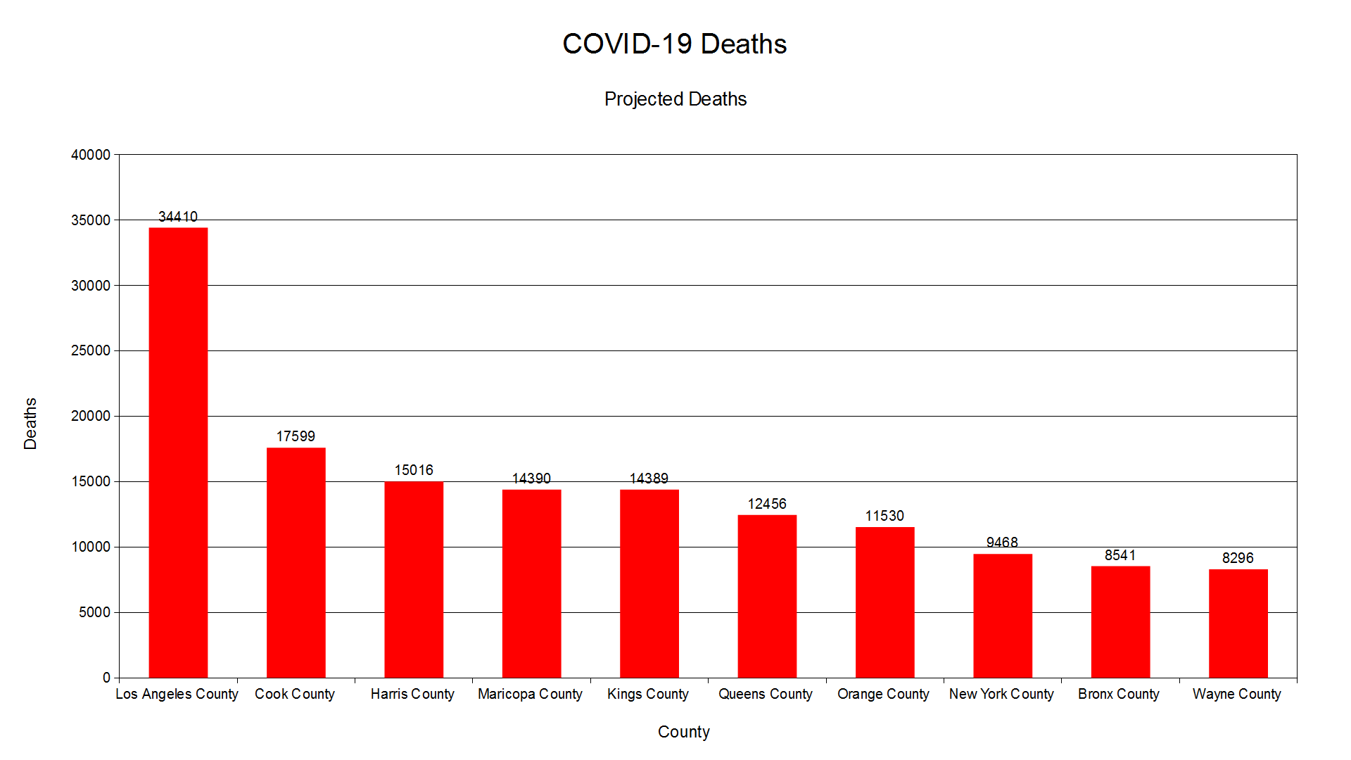
In terms of projected deaths, Los Angeles County has the highest at 34,410. Cook County has 17,599 deaths, while Harris County has 15,016 deaths. Four of five New York City boroughs are in the top 10 projected deaths. They are Kings (Brooklyn), Queens (Queens), New York (Manhattan), and Bronx (The Bronx). Wayne County has 8,296 projected deaths. I decided to average 95% confidence interval upper bound only and projected deaths.


Los Angeles County has 30,831 projected deaths. Kings County (Brooklyn) has more deaths than Harris County. Again, four of the five New York City boroughs are in the top 10 for average projected deaths. Here is the total deaths for New York City including Staten Island, which is Richmond County.
Reported: 34,520
Provisional: 30,419
95% Confidence Interval Lower Bound: 25,609
95% Confidence Interval Upper Bound: 39,330
Projected Deaths: 46,803
Average Deaths: 43,067
New York City could have nearly 47,000 COVID-19 deaths. New York City was hit very hard early in the pandemic back in 2020. It is probable some COVID-19 deaths in New York City went undetected or classified as something else. Here is the total deaths for America.
Reported: 717,772
Provisional: 745,792
95% Confidence Interval Lower Bound: 704,323
95% Confidence Interval Upper Bound: 759,241
Projected Deaths: 1,016,452
Average Deaths: 986,457
Some counties that have both reported and provisional deaths are the same. As a result, they did not produce standard deviation and could not get confidence interval as a result. It occurred with 15 counties. They are:
Rockdale County, GA
Wayne County, OH
Kerr County, TX
City of Fairfax, VA
Union County, MS
Wasco County, OR
Hughes County, SD
Knox County, KY
Seward County, KS
Love County, OK
Deer Lodge County, MT
St. Clair County, MO
Nelson County, ND
Monroe County, MO
Ketchikan Gateway Borough, AK
If those 15 counties are included, which is just projected deaths, the total is 988,096. Provisional deaths are deaths based on death certificate that state COVID-19 as the cause of death. Provisional deaths are subject to change. The provisional deaths are lower than reported deaths. Reported deaths included suspected deaths from COVID-19.
If projected deaths are to be used to calculate COVID-19 deaths, there could be up to a million deaths in America. There were likely COVID-19 deaths that went undetected in America before it was declared a pandemic on March 11, 2020. Some of these deaths are likely classified as something else. However, I think a million deaths from COVID in America is on the high side. As COVID-19 pandemic winds down, we should probably get a better idea of how many people died from the coronavirus.
How 2021 Compares To 2020 So Far

It has been 279 days into 2021 and COVID-19 remains a problem worldwide. How does 2021 compare to 2020 so far? The data is from Our World In Data.
The 2020 deaths are starting at February 29, 2020. The 2021 deaths are up to October 5, 2021. The death toll is 705,225 per Our World In Data. Worldometer has a death toll of 727,274 as of October 6, 2021. Here is a graph for COVID-19 deaths by year. All graphs are created from Apache OpenOffice.

2020 had 352,001 deaths, while 2021 had 353,224 deaths as of October 5, 2021. Some deaths are unreported or over reported as COVID despite being something else. Based on deaths, more people died in 2021 than in 2020. Here is a graph of COVID-19 cases by year.

The case numbers and positive rates are starting at March 1, 2020. 2020 had 20,153,382 confirmed cases. 2021 had 23,306,936 confirmed cases. The green is Total Projected With Positive Rate; blue is Total Projected With Adjusted Positive Rate Cases; yellow is Total Projected Average Cases. Here are the formulas:
Total Projected With Positive Rate
(New Cases Per Capita + Positive Rate) / (100 + Negative Rate)
Total Projected With Adjusted Positive Rate Cases
Adjusted Positive Rate
Positive Rate / Negative Rate
((New Cases Per Capita + Adjusted Positive Rate) / (100 + Negative Rate)
Total Projected Average Cases
(Total Projected With Positive Rate + Total Projected With Adjusted Positive Rate Cases) / 2
The rate is multiplied by 333,087,850, which is from Worldometer. The projected cases suggest there were more COVID-19 cases in 2020 than in 2021. However, 2021 is subject to change as it is still 2021. Here is a chart of cases by month.

Looking at the monthly chart, April 2020 likely had the most COVID-19 cases. April 2020 had somewhere between 16,578,160 to 20,222,598 with average of 18,400,379. That is when most of America and world were in lockdown. COVID-19 was likely widespread early on as cases could of started as early as summer or fall 2019 in America. It is probable COVID-19 could of started as early as Summer 2019 in Wuhan. A study at UCLA Hospital system had large increase of cough and pulmonary disease from December 2019 to February 2020. This suggests COVID-19 was already in America before it was even identified.
Here are charts of daily new cases and positive rate.


The number of confirmed new cases in Spring 2020 is lower compared to Winter 2020-2021 or Summer 2021. However, the positivity rate is overall higher in Spring 2020. The daily high positive rate suggests that COVID-19 is much more widespread than reported. If the projected cases are any indication, it is likely nearly half of America got infected with the coronavirus. This is based on from test results, so the actual number of infections is likely higher.
The Summer 2021 Surge

COVID-19 cases have been rising since July 2021. It is largely because of the Delta variant, which is more contagious. Many of the cases are children. There are 5,292,837 cases among children as of September 9, 2021. Many people are hospitalized as a result. Here are graphs of cases, deaths, and positive rate. They are from Our World In Data and the graphs are generated from OpenOffice.


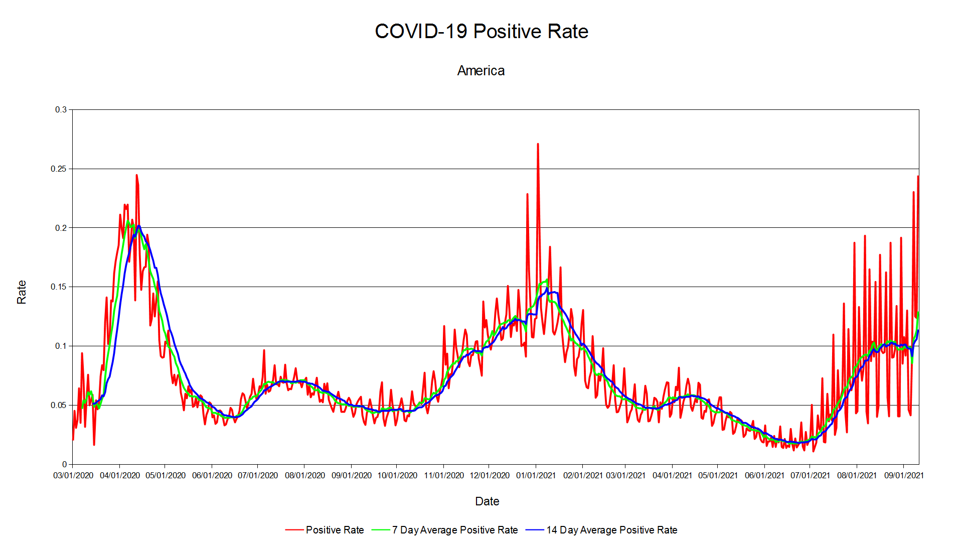

The number of new cases is on the same level as Winter 2020-2021 wave. The number of new tests is below the winter wave. The positive rate is below Spring 2020 and Winter 2020-2021 wave. The number of new deaths are less than Spring 2020 and Winter 2020-2021 wave. This is based on the 7 day and 14 day average.
Do these numbers reflect how severe COVID is? The devils are in the details. The number of hospitalization is certainly high right now. How many of them are hospitalized have severe COVID or for something other than COVID? Here is an article from The Atlantic titled Our Most Reliable Pandemic Number Is Losing Meaning. Here is an excerpt:
If you want to make sense of the number of COVID hospitalizations at any given time, you need to know how sick each patient actually is. Until now, that’s been almost impossible to suss out. The federal government requires hospitals to report every patient who tests positive for COVID, yet the overall tallies of COVID hospitalizations, made available on various state and federal dashboards and widely reported on by the media, do not differentiate based on severity of illness. Some patients need extensive medical intervention, such as getting intubated. Others require supplemental oxygen or administration of the steroid dexamethasone. But there are many COVID patients in the hospital with fairly mild symptoms, too, who have been admitted for further observation on account of their comorbidities, or because they reported feeling short of breath. Another portion of the patients in this tally are in the hospital for something unrelated to COVID, and discovered that they were infected only because they were tested upon admission. How many patients fall into each category has been a topic of much speculation. In August, researchers from Harvard Medical School, Tufts Medical Center, and the Veterans Affairs Healthcare System decided to find out.
The Atlantic Our Most Reliable Pandemic Number Is Losing Meaning.
Turns out many who are hospitalized for COVID have mild to asymptomatic COVID. They are hospitalized for other reasons due to pre-existing health problems. Many were tested after being admitted to the hospital for other than COVID. They were tested for COVID and were positive for the coronavirus after their admission. One has to wonder how many of these positives are false positives.
Here is a study conducted at the Veterans Affair (VA) hospital. It is titled The COVID-19 Hospitalization Metric in the Pre- and Post-vaccination Eras as a Measure of Pandemic Severity: A Retrospective, Nationwide Cohort Study. It was a study conducted at multiple VA hospitals. They did the study before and after vaccines were available. The study was recently released and not peer reviewed yet. Here is one interesting part of the journal.
Results: Among 47,742 admissions in 38,508 unique patients with laboratory-confirmed SARS-CoV-2, N=28,731 met the criteria for moderate-to-severe COVID-19. The proportion with moderate-to-severe disease prior to widespread vaccine availability was 64.0% (95% CI, 63.1-64.9%) versus 52.0% in the later period (95% CI, 50.9-53.2%), p-value for non-constant effect, <0.001. Disease severity in the vaccine era among hospitalized patients was lower among both unvaccinated (55.0%, 95% CI, 53.7-56.4%) and vaccinated patients (42.6%, 95% CI, 40.6-44.8%).
The COVID-19 Hospitalization Metric in the Pre- and Post-vaccination Eras as a Measure of Pandemic Severity: A Retrospective, Nationwide Cohort Study
The proportion of severe COVID is not much different between before and after vaccines. The vaccines have increased proportion of asymptomatic and mild COVID patients in hospitals. The study only looked at VA hospital patients. However, it does give some insight into COVID patients in hospitals. Hospitals are overcrowded with mild to asymptomatic COVID. That certainly adds a lot of burden to hospitals. Here is another study in California among pediatric COVID patients from Hospital Pediatrics Adjudicating Reasons for Hospitalization Shows That Severe Illness From COVID-19 in Children Is Rare. Here is an excerpt:
Kushner et al conducted an extensive chart review of 117 pediatric hospitalizations with a positive SARS-CoV-2 PCR from May 10, 2020 to February 10, 2021 at a quaternary care academic children’s hospital In Northern California. Study authors used a set of pre-determined criteria to characterize each hospitalization as either “likely” or “unlikely” for COVID-19 disease. They found that 53 hospitalizations (45%) were unlikely to be due to disease caused by SARS-CoV-2. Rather, patients were hospitalized for a wide range of other diagnoses, including bacterial infections, scheduled surgical procedures, appendicitis, ingestions, anaphylaxis, and neurologic conditions. Of the 64 patients who were likely to have been hospitalized for COVID19, 3 were asymptomatic and 27 had mild to moderate symptoms, with 20 characterized as either severe or critical (the remaining 14 were diagnosed with MIS-C).
Hospital Pediatrics Adjudicating Reasons for Hospitalization Shows That Severe Illness From COVID-19 in Children Is Rare
Webb et al reviewed the charts of 146 children hospitalized with a positive SARS-CoV-2 PCR at another large children’s hospital in California from May 1st, 2020 to September 30, 2020 (17 children with MIS-C were excluded from the analysis). Each hospitalization was characterized as either 1) “incidental” if describing patients who had no symptoms of COVID-19 and had an alternate diagnosis that led to admission; 2) “potentially symptomatic” describing patients with COVID-19 symptoms (fever, respiratory symptoms, GI symptoms) but who were primarily admitted for another reason and did not require any respiratory support; or 3) “significantly symptomatic” defined as patients with respiratory or cardiac symptoms consistent with COVID19 disease and requiring respiratory or ICU level support. Of 146 non-MISC patients with a positive PCR, 40% were found to be incidentally infected, 47% were deemed “potentially symptomatic” and 14% were significantly symptomatic.
There are 2 reviews in California hospitals. One is based on 117 patients at a Northern California hospital. They found 45% had something other than COVID. Twenty of the 64 patients had severe COVID, while 30 were asymptomatic to mild COVID. The other review had 146 children hospitalized for COVID. MIS-C patients were excluded from the review. Of the 146 patients, 40% were asymptomatic, 47% had mild symptoms, and 14% had possible severe COVID. The study is not perfect as it is confined to patients at those hospitals. However, reported hospitalization overestimates the COVID burden.
What to make of this? Hospitalization data is a flawed metric to measure how severe and widespread COVID is. Many hospitalized COVID cases are asymptomatic or mild or have other illnesses. New cases and positive rates only see what is in front of us. For every confirmed cases, there are many that go undetected. As I mentioned earlier, how many of these new cases are false positives. Or vice versa, how many of the negative cases are false negatives.
If hospitalized people are there for other than COVID, they should not be included as hospitalized patients for COVID. We should also look at false positives. I wonder how many of these hospitalized patients are false positives. I have not seen any data on it as far as I am aware of. It would be interesting to see false positive rates.
COVID-19 Resurging?

Everywhere in the news, they talk about resurgence of COVID-19 cases in America and around the world. It is because of the Delta variant of SARS-CoV-2 or COVID-19, which originated from India. COVID-19 cases are increasing in America. Los Angeles County and Austin are ordering mask mandate again. South Korea reported all time highs of over 1,600 new COVID-19 cases. Tokyo has reported more than 1,300 new cases as the 2020 Olympics start on July 23, 2021. It was delayed last year due to COVID-19 pandemic. Indonesia is becoming new epicenter of COVID-19 pandemic. As of July 15, 2021, there are 189,738,910 confirmed COVID-19 cases and 4,083,149 deaths per Worldometer.
The big question is, are COVID-19 cases really resurging? I am going to look at America, South Korea, and Japan. The data is from Our World In Data. I created graphs using OpenOffice Calc. The charts are new cases, new tests, and positivity rate. Let’s look at America.


The number of new cases are going up as they have been decreasing in America since Spring 2021. The number of new tests have trended downwards. The positive rates have gone up and there is a spike of nearly 15 percent positive rate. However, the test numbers from Our World In Data is up to July 9, 2021. More updated new test numbers should give us a better idea. The positive rate is what I would look at, not new case numbers. Spring 2020 had higher positive rate than in Summer 2020, Fall 2020, or Winter 2020-2021 and up to July 15, 2021. Let’s look at South Korea.


South Korea new cases have been higher lately. The positivity rate are the same level as Spring 2020 and Fall 2020 levels, which is troubling. South Korea have missing test numbers from Our World In Data. The new test numbers are up to July 9, 2021. More updated test numbers would be helpful to get us an idea of how widespread COVID-19 is in South Korea. The Spring 2020 cases were mostly in Daegu. Summer 2020 to July 15, 2021 have been mostly in Seoul and Seoul Capital Area. Seoul Capital Area is home to 26 million or more than half of South Koreans. More people live in the Seoul Capital Area than New York City area or Tri-State Area. Lastly, let’s look at Japan.


Japan cases have been trending upwards, but the positive rate is lower than in Spring 2020 or Winter 2020-2021. Japan have missing test numbers from Our World In Data. The new test numbers are up to July 9, 2021. More updated test numbers would be helpful to get us an idea of how widespread COVID-19 is in Japan. Some of the positive rate is above 100 percent and had to remove it from the chart. It looks like in Spring 2020, the positive rate was much higher. It suggests COVID-19 was likely more widespread in Japan early on. The positive rates have spikes in the Fall 2020 and another wave in Winter 2020-2021. The positive rate is much lower on the eve of the 2020 Olympics. It will have to be monitored throughout the month.
Looking at the numbers, the numbers are trending upwards. The positive rate is also climbing, but nowhere close to Spring 2020 or Winter 2020-2021. The new test numbers have been trending downwards in America, South Korea, and Japan. I would more focus on positive rates than new case numbers. I would like to look at hospitalization numbers to gauge COVID-19 cases and severity.
Calculating COVID-19 Cases And Deaths

COVID-19 is everywhere from China, Iran, Italy, South Korea, South Africa, America, Argentina, to even the remote island of St. Helena. Do positive rate, confirmed cases, and confirmed deaths reveal the truth scope of the COVID-19 pandemic? There have been attempts to calculate the truth death toll from the pandemic. They mostly center around COVID-19 deaths ranging from COVID-19 caused 6.9 million deaths to estimation of COVID-19 deaths. Russia acknowledged the death toll is 225,000. Peru revised the death toll to over 180,000. Mexico has reported a over 488,000 excess death as of May 25, 2021.
The data is from Worldometer from June 8, 2021. Here are confirmed cases and deaths maps as of June 8, 2021.
Confirmed Cases

Deaths

Confirmed Cases Per 1,000,000

Confirmed Deaths Per 1,000,000

Here are the formulas I have used to calculate COVID-19 cases and deaths:
Projected Per Capita Cases With Positive Rate
(1 + Confirmed Case Rate Per Capita + Positive Rate) / (2 + Not Infected Per Capita)
Projected Per Capita Cases Without Positive Rate
(1 + Confirmed Case Rate Per Capita) / (2 + Not Infected Per Capita)
Average Projected Per Capita Cases
(Projected Per Capita Cases With Positive Rate + Projected Per Capita Cases Without Positive Rate ) / 2
Projected Per Capita Deaths
(Death Per Capita + Death Rate) / (10 + Not Deaths Per Capita)
Some nations have not reported positive rates. Some nations are excluded as they have less than 10 confirmed COVID-19 cases. Here are the maps.
Projected Per Capita Cases With Positive Rate Per 1,000,000

Projected Per Capita Cases Without Positive Rate Per 1,000,000

Average Projected Per Capita Cases Per 1,000,000

Projected Death Per 1,000,000

Here are projected cases and deaths map. They are all multiplied by the nation’s most recent population. They are from Worldometer.
Projected Cases With Positive Rate

Projected Cases Without Positive Rate

Average Projected Cases

Projected Deaths

Top 10 Nation With Most Confirmed Cases
| Nation | Total Confirmed Cases |
| USA | 34,242,866 |
| India | 29,088,176 |
| Brazil | 17,038,260 |
| France | 5,719,937 |
| Turkey | 5,300,236 |
| Russia | 5,145,843 |
| UK | 4,528,442 |
| Italy | 4,235,592 |
| Argentina | 4,008,771 |
| Germany | 3,712,595 |
Top 10 Nation With Most Deaths
| Nation | Total Deaths |
| USA | 613,052 |
| Brazil | 477,307 |
| India | 353,557 |
| Mexico | 228,838 |
| Peru | 187,157 |
| UK | 127,854 |
| Italy | 126,690 |
| Russia | 124,496 |
| France | 110,137 |
| Colombia | 92,923 |
Top 10 Nation With Most Projected Cases With Positive Rate
| Nation | Projected Cases With Positive Rate |
| India | 514,175,884 |
| China | 480,088,948 |
| USA | 134,721,699 |
| Brazil | 104,056,061 |
| Indonesia | 102,809,095 |
| Pakistan | 80,532,140 |
| Nigeria | 75,873,534 |
| Bangladesh | 63,204,605 |
| Mexico | 59,391,047 |
| Russia | 52,778,275 |
Top 10 Nation With Most Projected Cases Without Positive Rate
| Nation | Projected Cases |
| China | 719,730,365 |
| India | 718,386,033 |
| USA | 193,483,936 |
| Indonesia | 139,519,293 |
| Brazil | 120,294,577 |
| Pakistan | 113,146,606 |
| Nigeria | 105,570,654 |
| Bangladesh | 83,724,030 |
| Russia | 76,925,150 |
| Mexico | 66,942,155 |
Top 10 Nation With Most Average Projected Cases
| Nation | Average Projected Cases |
| India | 616,280,958 |
| China | 599,909,656 |
| USA | 164,102,818 |
| Indonesia | 121,164,194 |
| Brazil | 112,175,319 |
| Pakistan | 96,839,373 |
| Nigeria | 90,722,094 |
| Bangladesh | 73,464,317 |
| Russia | 64,851,713 |
| Mexico | 63,166,601 |
Top 10 Nation With Most Projected Deaths
| Nation | Projected Deaths |
| China | 6,644,559 |
| India | 1,571,046 |
| Mexico | 1,133,533 |
| Indonesia | 703,167 |
| USA | 597,510 |
| Brazil | 588,436 |
| Egypt | 543,605 |
| Yemen | 541,932 |
| Pakistan | 469,340 |
| Russia | 332,442 |
The nation with the most projected cases since the pandemic started depends on various calculations. India could have 514,175,884 to 718,386,033 infected. China could have 480,088,948 to 719,730,365 infected. The test number for China has been static at 160 million. America could have 134,721,699 to 193,483,936 infected. Averaging Projected Cases With Positive Rate and Projected Cases Without Positive Rate, India has the most at 616,280,958 infected. China comes in second at 599,909,656 infected. America has 164,102,818 infected.
In terms of projected deaths, China has the most at 6,644,559 deaths. India comes in second at 1,571,046 deaths. Mexico could have 1,133,533 deaths, while Indonesia could have 703,167 deaths. America could have 597,510 as some of the deaths could be over reported and classified as COVID-19 despite being something else. Russia and Mexico have acknowledged their death toll is much higher than what is reported. China’s reported case numbers and death toll is likely dubious. The number of infected and deaths is likely much higher in China.
What is the total projected cases and deaths from COVID-19? Here is a table.
| Category | Total |
| Total Confirmed Cases | 174,731,197 |
| Confirmed Deaths | 3,762,254 |
| Projected Cases With Positive Rate | 2,887,774,962 |
| Projected Cases Without Positive Rate | 4,049,677,682 |
| Average Projected Cases | 3,488,395,186 |
| Projected Deaths | 19,960,562 |
It could be somewhere between 2,887,774,962 to 4,049,677,682. The projected death toll is 19,960,562. We can use the 95% Confidence Interval. The projected rates are multiplied by 7,829,159,921 to get case and death numbers. It is the most recent estimate of the world population.
Projected Per Capita Cases With Positive Rate
| Projected Case Mean | 0.385 | 3,014,771,088 |
| Projected Case 95% Lower Bound | 0.379 | 2,969,688,593 |
| Projected Case 95% Upper Bound | 0.391 | 3,059,853,661 |
Projected Per Capita Cases Without Positive Rate
| Projected Case Mean | 0.529 | 4,145,316,186 |
| Projected Case 95% Lower Bound | 0.525 | 4,111,009,120 |
| Projected Case 95% Upper Bound | 0.534 | 4,179,623,330 |
Average Projected Per Capita Cases
| Projected Case Mean | 0.457 | 3,580,043,637 |
| Projected Case 95% Lower Bound | 0.453 | 3,544,372,105 |
| Projected Case 95% Upper Bound | 0.462 | 3,615,715,247 |
Projected Per Capita Deaths
| Projected Death Mean | 0.002 | 14,484,337 |
| Projected Death 95% Lower Bound | 0.002 | 12,559,147 |
| Projected Death 95% Upper Bound | 0.002 | 16,409,528 |
The projected cases is consistent with range from 2,969,688,593 with positive rate to 4,179,623,330 without positive rate, just per capita. The confidence interval is fairly narrow in terms of projected cases. On the other hand, the projected death ranges from 12,559,147 to 16,409,528 deaths worldwide. It is nowhere close to the nearly 20 million deaths.
There is a five percent chance that it is not within the true mean. It could be outside the 95% confidence interval. It could mean either there could be less or more COVID-19 infections and deaths.
The calculated cases and deaths are just projections. They are to be taken with caution. They can give us an idea of potential COVID-19 infection and deaths.
A Look Into COVID-19 Vaccine Reaction
There have been 289,212,304 COVID-19 vaccines administered in America. 165,074,907 Americans have received at least one dose. 131,850,089 are now fully immunized per Centers for Disease Control and Prevention (CDC). With any vaccines, there are bound to be people who have adverse reaction(s).
The U.S. Department of Health and Human Services (HHS) runs Vaccine Adverse Event Reporting System (VAERS). It was established in 1990. Vaccine adverse reactions are reported. One can search for adverse reaction for COVID-19 vaccines. It includes other vaccines for other diseases. I managed to get COVID-19 vaccine reaction data from VAERS. The data is updated weekly. As of May 25, 2021, there are 227,612 adverse reaction to COVID-19. Let’s break it down by age group, sex, and age group and sex. Here are bar charts I made from OpenOffice.


Most reported adverse reaction to COVID-19 vaccine occur in females. They mostly occur in the age 65+ females. Most COVID-19 vaccines are given to people who are 65+. 85.5% of COVID-19 vaccines are administered to 65+. The total is 46,742,786. The large number of vaccines administered is bound to have more adverse reaction. The age 30-39 and 40-49 also have large number of adverse reaction. Interestingly, there are less reports of adverse reaction in age 60-64 group. In all age groups, females are more likely to have adverse reaction. The exception is under 6 months, which had more males than females.
Here are the symptoms. It only shows the top 50 most reported symptoms. There are 6,945 symptoms of adverse reaction.

The most commonly reported symptoms are headache, fever, chills, fatigue, and pain. 4,163 reported having contracted COVID-19. 3,401 have reported death. It is unclear if the symptoms and death are connected to adverse reaction to COVID-19 or something else. Here is the disclaimer they put:
VAERS accepts reports of adverse events and reactions that occur following vaccination. Healthcare providers, vaccine manufacturers, and the public can submit reports to VAERS. While very important in monitoring vaccine safety, VAERS reports alone cannot be used to determine if a vaccine caused or contributed to an adverse event or illness. The reports may contain information that is incomplete, inaccurate, coincidental, or unverifiable. Most reports to VAERS are voluntary, which means they are subject to biases. This creates specific limitations on how the data can be used scientifically. Data from VAERS reports should always be interpreted with these limitations in mind.
The strengths of VAERS are that it is national in scope and can quickly provide an early warning of a safety problem with a vaccine. As part of CDC and FDA’s multi-system approach to post-licensure vaccine safety monitoring, VAERS is designed to rapidly detect unusual or unexpected patterns of adverse events, also known as “safety signals.” If a safety signal is found in VAERS, further studies can be done in safety systems such as the CDC’s Vaccine Safety Datalink (VSD) or the Clinical Immunization Safety Assessment (CISA) project. These systems do not have the same limitations as VAERS, and can better assess health risks and possible connections between adverse events and a vaccine.
Key considerations and limitations of VAERS data:
- Vaccine providers are encouraged to report any clinically significant health problem following vaccination to VAERS, whether or not they believe the vaccine was the cause.
- Reports may include incomplete, inaccurate, coincidental and unverified information.
- The number of reports alone cannot be interpreted or used to reach conclusions about the existence, severity, frequency, or rates of problems associated with vaccines.
- VAERS data are limited to vaccine adverse event reports received between 1990 and the most recent date for which data are available.
- VAERS data do not represent all known safety information for a vaccine and should be interpreted in the context of other scientific information.
It is hard to say if all the symptoms are connected to COVID-19 vaccine or not. Some of them are not likely connected to COVID-19 vaccine. The more severe symptoms and deaths should be investigated further to determine if adverse reaction is the cause or not. Here is a GIS map of COVID-19 vaccine adverse reaction by state. It is from VAERS. The maps are created with QGIS.
Total Reported COVID-19 Vaccine Adverse Reaction By State

Per Capita By 100,000 Of COVID-19 Vaccine Adverse Reaction By State

The state with the most COVID-19 vaccine adverse reaction is California. The state with the most per capita for COVID-19 vaccine adverse reaction is Indiana.
The VAERS data is always changing and is subject to change. The most severe reaction to COVID-19 vaccine should be investigated further. That includes people who have died. The investigation could reveal what caused their symptoms and/or death, so we can identify risk groups for adverse reaction to COVID-19 vaccine.
